The aria graphics library is responsible for presenting a visual means of interaction between a user and an application. The library provides the building blocks to construct a complex user interface and is responsible for managing the interface once created. It is also responsible for responding to external input from users other sources and reacting appropriately. The goals of this library are to be:
- Able to provide a simple but powerful user experience
- Customizable to the needs of the application
- Light and flexible with regards to resource consumption
- Easily extensible to meet future design needs
Alignment – Indicates the placement of objects within a given bounding area
Bounding Rectangle – The rectangle that an object occupies in a given space
Context – A discrete instance of the user interface library
Event – An indication of some kind of occurrence that may require attention
Layer – Directly related to the layers offered by the Hardware Abstraction Layer. Aria layers also function as direct children to a screen. Widgets are added to layers and become part of the overall widget tree.
Margin – A buffer area at the edge of a bounding rectangle
Occlusion – The state of being completely obstructed by another entity.
Rasterize – The process of translating a user interface model from a logical mathematical representation into a visual image.
Scheme – A list of colors that can be referenced for drawing purposes
Screen – The root node of a widget tree. Represents a discrete configuration of layers and widgets. Can have a unique life cycle for custom memory management.
String – A logical array of linguistic characters
Widget – An abstract object that is part of a user interface
Widget Tree – A tree data structure of widgets that, when rendered, generates a user interface image.
The aria graphics library is responsible for:
- HAL Configuration
- Widget Tree Management
- Event Management
- Input Handling
- Scene Rendering
HAL Configuration
The Aria User Interface library is context-based similar to other portions of the graphics stack. For ease of use, the library is responsible for creating and managing a HAL context internally. This releases the application from having to interact with the HAL API.
The context contains all of the information required to manage the state of the library. It contains the screen state, the event list, the input state, and various other settings.
Widget Tree Management
The widget tree is a tree data structure comprised primarily of widgets. At its root is a screen object. Each of the screen object’s direct children is a layer object. Any descendants of a layer are widgets.
Heterogeneous Space
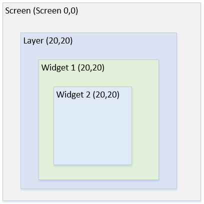
When dealing with objects in a tree it is helpful to understand objects do not live in the same coordinate space as their ancestors or descendants. Each level of the tree represents a unique area of spatial coordinates with the root coordinate space, or the screen space, being the physical space of the display device. Each space is a two dimensional Cartesian coordinate system in both the positive and negative directions.
For example, assume a widget is a child of a layer which is a child of a screen. The screen position is (0,0) in physical space. The layer position is (20,20). Widget 1 is at (20,20) and widget 2 is at (20,20). All of these coordinates aside from the screen are relative. Each widget is (20,20) offset from its parent. However, Widget 2 is not at (20,20) in physical space, it’s actually (60,60). In global space each space builds on its parent, but it’s entirely relative.
The following is two screen examples showing different visual representations with identical logical (tree) representations.
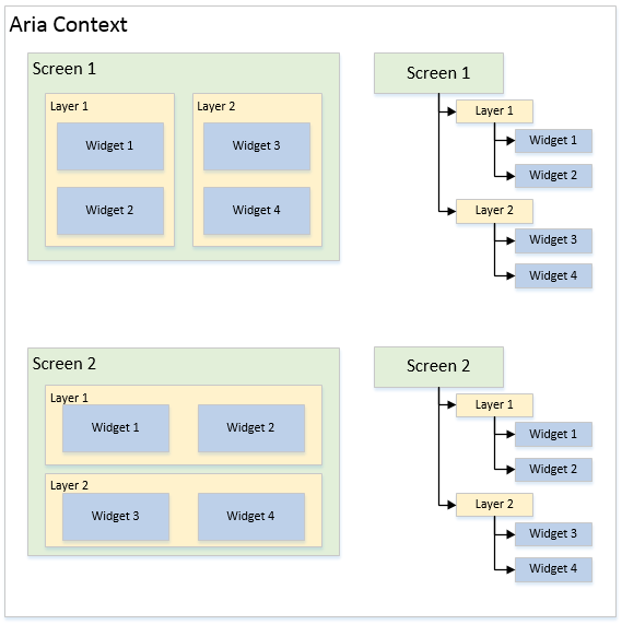
Using a tree to manage the logical state of a user interface provides numerous benefits.
- Position Inheritance – Child coordinate systems logically inherit from their parents but are not directly affected by them. Thus, if some ancestor changes position in its space, children likewise change overall position but their positions in their relative space do not change. This allows for easy manipulation of large portions of the user interface through very small changes.
- Intelligent Rendering – The tree structure allows for fast analysis of widget states when determining how and when to render the overall scene. Nodes in the tree track changes in the states of widgets and their descendants. This allows the library to use intelligent methods to cull portions of the user interface to avoid the processing overhead of redrawing widgets that have not changed.
- Effect Propagation – As with coordinate propagation, effects can also be inherited along tree branches. For instance, if some node in the tree is made invisible, all descendants are also made invisible. If a node is made partially transparent, then that transparency is propagated to all descendant nodes.
A screen is defined as the logical root of the user interface scene. Its direct descendants are always one or more layers, as seen in the above diagram. Its size always matches the physical dimensions of the display device used.
The life cycle of a screen can be configured to better manage run-time memory usage. The relevant options are:
Persistent – By default screens will create their widget tree when shown and will free the memory consumed by their widget tree when they are hidden. A screen that is marked as persistent will not free their widget tree when hidden. This allows widgets in a screen to maintain their state when the screen is no longer visible. The downside is that more heap memory is consumed.
Create At Startup – By default screens are only created when they are shown thus keeping run-time memory usage to a minimum. However, the application may want to access widgets in a screen before it is shown for the first time. This option will cause the screen to allocate all of its memory when the screen is first added to the user interface library context.
Because the Hardware Abstraction Layer supports dynamic orthogonal orientation, screens can take advantage of this feature. Thus, screens have the option to set a magnitude of rotation to some factor of 90 degrees.
User interface layers serve several functions. They function as the de-facto root parent for widgets, they directly configure hardware layers in the graphics driver, and they manage per-layer effects.
In the simplest case the hardware supports a single layer that is the same dimension as the physical display. More advanced cases may have several layers that can have unique coordinates and dimensions within the physical display space.
When a screen becomes active, it iterates over all of its layers and applies the settings of each through the appropriate HAL APIs to set up the display state for that particular screen. Two screens may have different layer counts, layouts, and buffer counts.
Schemes in Aria are simply collections of colors with given names. If a scheme is assigned to a widget then that scheme will be referenced by that widget during rendering. Aria has an internal scheme that all widgets use by default in the event that a scheme is not assigned.
Below is a list of scheme colors and a description of how it is often used. There is no restriction on how a widget references a scheme. The color names are merely a recommendation.
Scheme Colors
- Base – Default area fill
- Highlight – Light embossing
- Highlight Light – Very light embossing
- Shadow – Dark embossing
- Shadow Dark – Very dark embossing
- Foreground – A foreground color
- Foreground Inactive – Foreground color when inactive
- Foreground Disabled – Foreground color when disabled
- Background – A background color, usually to differentiate from Base
- Background Inactive – Background when inactive
- Background Disabled – Background when disabled
- Text – Text color
- Text Highlight – Text color background when highlighted
- Text Highlight Text – Text color when highlighted
- Text Inactive – Text color when inactive
- Text Disabled – Text color when disabled
A widget is an abstract representation of an object in the user interface. In its most basic form it is a rectangle that is capable of drawing a border, a background color, and containing child widgets. More specific implementations extend the basic widget implementation to provide advanced functionality.
The Aria library relies on function pointers to take advantage of some object oriented programming concepts like inheritance and polymorphism.
Widgets are typically created by calling their specific “new” function. For instance: “laWidget_New()” will allocate a new basic widget and return a pointer to it (similar to calling new in C++). Calling this function will automatically initialize the widget by calling the constructor for that widget. Deleting widgets is done through the use of the function “laWidget_Delete()”.
Widgets can then be added to layers or other widgets as desired.
Edit Widgets
Edit widgets are a special class of widget that inherits from the EditWidget base implementation instead of Widget. These widgets are capable of becoming the active “edit” widget which means that they will receive any edit events raised by a widget capable of issuing edit events, such as a key pad.
Widget Implementations
The following are descriptions of the widgets offered by Aria:
- Button
- Standard button type widget.
- Can have text and image icon.
- Has a toggle mode.
- Check Box
- Standard check box widget.
- Has built in image for checked and unchecked state.
- Can use custom image for checked and unchecked state.
- Circle
- Widget that draws a circle
- Draw Surface
- Widget that has a callback during its paint loop
- Allows application to make raw HAL draw calls during Aria’s paint loop
- Gradient
- Widget that draws linearly interpolated gradient for its background
- Can use as a parent for other widgets to achieve custom backgrounds
- Group Box
- Widget that functions as a decorated container
- Offers a line border and a horizontally aligned title
- Image
- Widget that draws an image
- Image is clipped to the bounds of the widget.
- Image can be vertically or horizontally aligned to the bounds of the widget
- Image Sequence
- Widget that functions as an automatic image slideshow renderer
- Can add a sequence of widgets and a list of time delays
- Can automatically cycle through list of images without application input
- Key Pad
- A grid of button widgets
- Buttons can be configured to send edit events to the library edit API
- Label
- Widget that draws a string
- Can be aligned vertically and horizontally
- Line
- Widget that draws a line between two specified coordinates
- List
- A list box of strings
- Strings can have icons
- Can be configured to have single, sequential, or multi-selection state
- List Wheel
- A rotating wheel of strings
- Cycles seamlessly through the list
- Responds to drag input
- Panel Widget
- Panels are containers of other widgets, including daughter panels, in support of a parent-child tree of widgets, with the Panel widget as the parent
- Progress Bar
- Widget that fills in a direction based on a given percentage
- Radio Button
- A button that can belong to a group of radio buttons
- Only one button in group can be selected at any one time
- Rectangle
- Widget that draws a rectangle
- Scroll Bar
- A scroll bar that has a configurable scroll range.
- Normally embedded in other widgets like the list box
- Slider
- A widget that slides between a min and max value
- Text Field
- A field of text that can be modified by edit event inputs
- Touch Text
- A widget that draws lines based on input events
- Helps to demonstrate input functionality
- Window
- A container that can be decorated with a title bar
- Title bar can have title text and an icon
The Aria state maintains an internal list of events that must get serviced frequently. This is done by called by “laUpdate()”. This is known as the ‘update loop’.
The user interface library has no knowledge of existing hardware but it must provide the means for the user to interact with the scene. Aria thus provides several generic APIs to allow any source to inject input events into the system. These events are stored in the internal event list and are handled during the next update phase.
The widget tree is a logical representation of the state of the user interface. The library must be capable of transforming this information into a visual representation that can be sent to the graphics display. The actual rendering is handled by the HAL. The individual widgets contain the algorithms necessary to render themselves but Aria is responsible for telling the widgets when to render themselves. This is known as the ‘paint loop’
The library is responsible for evaluating the widget tree to detect widgets that indicate invalid visual states and managing the redraw. It is essential that widgets only redraw when necessary to avoid needlessly consuming processing resources. It is also important that the library not attempt to draw too much at once as that may starve the rest of the application.
// initialize the HAL layer
GFX_Initialize();

// initialize the user interface library
laInitialize();

// create a ui context and set active
laContext* uiContext;

iuContext = laContext_Create(0, 0, 0, GFX_COLOR_MODE_RGB_565, NULL);
laContext_SetActive(uiContext);

// create a screen
laScreen* screen;

screen = laScreen_New(LA_FALSE, LA_FALSE, &screenCreate);

// add screen to context
laContext_AddScreen(screen);

// this would be done inside a function called “screenCreate()”
// create layer
laLayer* layer0 = laLayer_New();
laWidget_SetPosition((laWidget*)layer0, 0, 0);
laWidget_SetSize((laWidget*)layer0, 480, 272);

// create a buffer in the layer
laLayer_SetBufferCount(layer0, 1);

// set the layer to the screen
laScreen_SetLayer(screen, 0, layer0);

// create a child widget
laButtonWidget* ButtonWidget1 = laButtonWidget_New();
laWidget_SetPosition((laWidget*)ButtonWidget1, 411, 201);
laWidget_SetSize((laWidget*)ButtonWidget1, 60, 60);
laWidget_SetLocalRedraw((laWidget*)ButtonWidget1, LA_TRUE);
laWidget_SetDrawBackground((laWidget*)ButtonWidget1, LA_FALSE);
laWidget_SetBorderType((laWidget*)ButtonWidget1, LA_WIDGET_BORDER_NONE);
laButtonWidget_SetPressedOffset(ButtonWidget1, 0);
laButtonWidget_SetReleasedEventCallback(ButtonWidget1, &ButtonWidget1_ReleasedEvent);

// add child to parent (layer 0)
laWidget_AddChild((laWidget*)layer0, (laWidget*)ButtonWidget1);

// do this inside application update loop
// update HAL
GFX_Update()

// set ui context as active
laContext_SetActive(uiContext);

// update context (argument is update time in ms)
laUpdate(0);
|
Name |
Description |
|
This section Aria User Interface Library Interface. | |
|
| |
|
This topic describes the graphics utilities which provide facilities which enhance the middleware library. | |
|
This topic provides information about the graphics library drivers available in MPLAB® Harmony Graphics Suite. | |
|
This topic describes the Hardware Abstraction Layer (HAL) which provides an abstraction layer between the middleware UI elements and graphics drivers. |
|
MPLAB® Harmony Graphics Suite
|