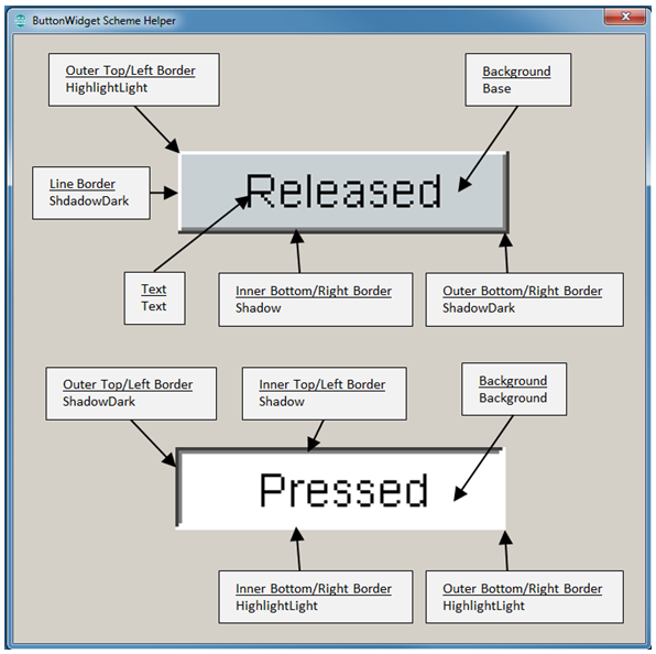
When the border is not set to None, and the background is not set to None, the button widget provides a direct visible clue to the user when it is pressed. Which can be seen in the following figure with the button from aria_quickstart. In aria_quickstart, ButtonWidget1 has a bevel border, and a fill background.
Let’s use aria_quickstart to demonstrate how to control ButtonWidget1 using a phantom button to surround it, thereby increasing touch responsiveness.
When using a bevel border and filled background, the button provides visible feedback when it is asserted.
To use this feedback mechanism instead of images, there is a way to have a small button on the display, with a larger touch zone provided by another phantom button.
Steps:
- Click on ButtonWidget1 in the Screen Designer panel. Go to the Properties Editor panel for the widget and uncheck the Enabled property to disable the button. Enable Toggleable so that this button will have a memory.
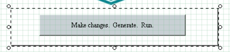
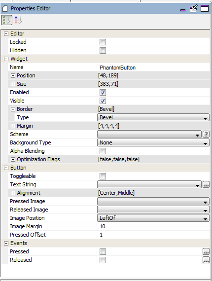
- Drag a new button from the Widget Tool Box panel and center it around ButtonWidget1. In the Properties Editor panel for this new button, change the name of the widget to PhantomButton. Change the Background Type to None. Leave the Border set as Bevel for now. The following figure displays the new button in the Screen Designer panel:
The Properties Editor panel should display the following information.
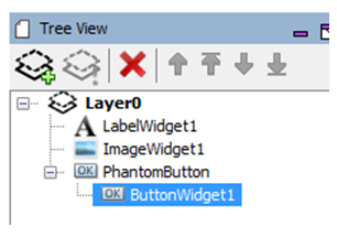
3. In the Tree View panel, drag ButtonWidget1 to be a daughter widget of PhantomWidget. When PhantomWidget is moved, ButtonWidget1 will move along with the parent.
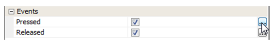
4. Click on PhantomButton again in the Screen Designer panel and move to the Properties Editor. Enable both the Pressed and Released events. Then click on the (…) icon to define the events. (See the following two steps.)
5. Defining the Pressed Event.
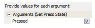
Click on the (…) icon. In the Event Editor, under Pressed dialog, click the New icon to define a new event. In the Action Edit Dialog that next appears, leave the selection on the template and hit the Next button. In the next window, select the target of the event. We want to change the state of ButtonWidget1, so select it and hit Next. The next dialog shows all the template actions that we can use to modify ButtonWidget1. Choose Set Pressed State and hit Next. Set the Argument to Enable Pressed. Name this event Set Press state for ButtonWidget1 then hit Finish. Leave the Event Editor by hitting Ok.
6. Defining the Released Event.
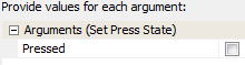
Click on the (…) icon. In the Event Editor, under Released dialog, click the New icon to define a new event. In the Action Edit Dialog that next appears, leave the selection on the template and hit the Next button. In the next window, select the target of the event. We want to change the state of ButtonWidget1, so select it and hit Next. Choose Set Pressed State and hit Next. Leave the Argument disabled. Name this event Unset Press state for ButtonWidget1 then hit Finish. Leave the Event Editor by hitting Ok.
7. Generate the application from the MPLAB Harmony Configurator main menu.
8. From the MPLAB main menu, build and run the project. To verify that ButtonWidget1 does change, click outside of the original boundaries.
9. As a final step, hide the PhantomButton by changing its border to None. Next, Generate the code again from MHC. Finally, build and run the project from MPLAB and see how much easier it is to assert ButtonWidget1 using a phantom button.
|
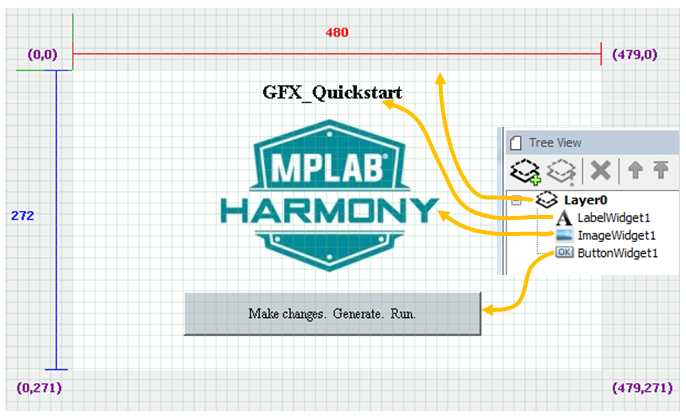
MPLAB® Harmony Graphics Suite
|