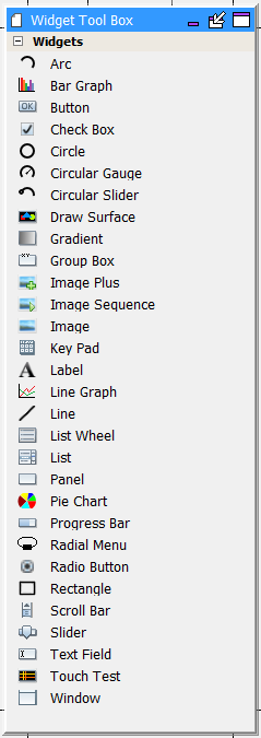
All the available graphics widgets are shown in the Widget Tool Box:
MPLAB Harmony Graphics Composer provides automatic code optimization by keeping track of the widgets that are currently being used. When MHC generates or regenerates the application, only the Graphics Library code necessary for the user-created design is included in the project.
There are two primary methods for creating new widget objects: clicking and dragging. To add a new layer to a screen use the Screens sub-tab.
The following actions can be performed by using the Click method:
- Clicking an item selects it as active. Users can then move the cursor into the screen window and view a representation of the object about to be added.
- Left-clicking confirms the placement of the new object
- Right-clicking aborts object creation
- Clicking the active item again deactivates it
Dragging and dropping a tool item into the Screen Designer Window creates a new instance of an object. When dragging a tool item, releasing the cursor outside of the Screen Designer Window cancels the drag operation.
The Graphics Composer Tool Box is the interface by which users add widgets into the screen representation.
|
Widget |
Example Application |
|
Arc |
aria_showcase_reloaded |
|
Bar Graph |
aria_showcase_reloaded, aria_weather_forecast |
|
Button |
aria_benchmark, aria_showcase, aria_quickstart, aria_weather_forecast |
|
Check Box |
aria_showcase_reloaded |
|
Circle |
None |
|
Circular Gauge |
aria_showcase_reloaded |
|
Circular Slider |
aria_showcase_reloaded |
|
Draw Surface |
None |
|
Gradient |
aria_showcase (background) |
|
Group Box |
None |
|
Image |
aria_quickstart |
|
Image Plus |
None |
|
Image Sequence |
aria_showcase |
|
Key Pad |
aria_showcase |
|
Label |
aria_quickstart |
|
Line |
None |
|
Line Graph |
aria_showcase_reloaded, aria_weather_forecast |
|
List Wheel |
aria_showcase |
|
List |
None |
|
Panel |
aria_benchmark, aria_showcase |
|
Pie Chart |
aria_showcase_reloaded |
|
Progress Bar |
aria_flash |
|
Radial Menu |
aria_showcase_reloaded |
|
Radio Button |
aria_showcase |
|
Rectangle |
aria_benchmark |
|
Scroll Bar |
None |
|
Slider |
aria_showcase |
|
Text Field |
aria_showcase |
|
Touch Test |
aria_showcase |
|
Window |
None |
Click Method
The following actions can be performed by using the Click method:
- Clicking an item selects it as active. Users can then move the cursor into the screen window and view a representation of the object about to be added.
- Left-clicking confirms the placement of the new object
- Right-clicking aborts object creation
- Clicking the active item again deactivates it.
Drag Method
Dragging and dropping a tool item into the Screen Designer Window creates a new instance of an object. When dragging a tool item, releasing the cursor outside of the Screen Designer Window cancels the drag operation.
Automatic Code Optimization
MPLAB Harmony Graphics Composer keeps track of the types of widgets that are used and updates the MHGC Tree View panel constantly to ensure that only the Graphics Library code necessary for your design is included in the project.
Widgets
Widgets can be configured by using the Properties Editor on the right side of the MHGC interface. Each widget has multiple properties to manage their appearance as well as their functioning. Most properties related to appearance are common between widgets, though some widgets require specific property entries.
- Arc – A graphical object in the shape of an arc. The arc thickness can be set and filled.
- Bar Graph – A graphing widget that shows data in categories using rectangular bars.
- Button - A binary On and Off control with events generation for Press and Release state.
- Check Box - A selection box with Checked and Unchecked states, and associated events.
- Circle - A graphical object in the shape of a circle.
- Circular Gauge – A circular widget that operates like a gauge, where the hand/needle position indicates a value.
- Circular Slider – A circular widget that can change values based on external input like touch. The slider is filled based on the value of the widget relative to the maximum value.
- Draw Surface - A container with a callback from its paint loop. a draw surface lets the application have a chance to make draw calls directly to the HAL during LibAria's paint loop.
- Gradient - A draw window that can be associated with a gradient color scheme. This allows for color variation on the window.
- Group Box - A container with a border and a text title. With respect to functionality, a group box is similar to a window.
- Image Sequence - A special widget that allows image display on screen to be scheduled and sequenced. Select the images to be displayed, and the order for display. A timer to trigger the transitions must be created by calling the image sequence APIs to show the next image from the timer callback function.
- Image - Allows an image to be displayed on screen. The size and shape of the widget decides the visible part of the image, as scaling is not enabled for images at this time.
- Image Plus - Allows an image to be displayed on screen. The image can be resized (aspect ratio lock is optional). The widget can be set to accept two-finger touch input.
- Key Pad - A key entry widget that can can be designed for the number of entries divided as specified number of rows and column entries. The widget has a key click event that can be customized.
- Label - A text display widget. This does not have any input at runtime capability. A Text Field widget should be used instead when user input is needed.
- Line - A graphical object in the shape of a line.
- Line Graph – A graphing widget that shows data in categories using points and lines.
- List Wheel - Allows multiple radial selections that were usually touch-based selections and browsing.
- List - Allows making lists of text and image items. The list contents, number of items, and the sequence can be managed through a List Configuration dialog box in the Properties box.
- Panel - A container widget that is a simpler alternative to DrawSurface as it does not have the DrawSurface callback feature.
- Pie Chart – A graphing widget that shows data entries as sectors in a circle.
- Progress Bar - Displays the progress pointer for an event being monitored through the "Value Changed" event in the Properties Editor.
- Radial Menu - A widget that groups any number of images into an elliptical carousel. It can configured as a touch interactive image carousel or interface menu.
- Radio Button - A set of button widgets that are selected out of the group one at a time. The group is specified by the Group property in the Properties Editor.
 Note: Note: |
The radio buttons in the same group must have the same group number specified in their properties. |
- Rectangle - A graphical object in the shape of a rectangle.
- Scroll Bar - Intended to be used with another relevant widget such as the List Wheel to scroll up and down. It has a callback each time the value is changed. The callback allows users to trigger actions to be handled on the scroll value change event.
- Slider - Can change values with an external input such as touch. Event callbacks on value change are also available through the Properties Editor.
- Text Field - Text input can be accepted into the text field from an external input or from a widget such as keypad. The Event 'Text Changed' in the Properties Editor is used for accepting the input. This widget can also generate an event when the widget is touched (gains focus) by the user or is no longer touched (loses focus).
- Touch Test - Allows tracking of touch inputs. Each new touch input is added to the list of displayed touch coordinates. The input is accepted through the 'Point Added' event callback in the Properties Editor.
- Window - A container widget similar to the Panel but has the customizable title bar.
|
MPLAB® Harmony Graphics Suite
|